Showing posts with label Layouts. Show all posts

Tuesday, April 17

Wolf Concept Art

Hey! Here's an early picture of the wolf I found.
It was as much about getting the look of the wolf down as determining the look of the background - I imagined it being very detailed and textured, as the detail of the tree, and the texture of the ground and sky, show.

The tree above's fairly detailed,
 but the camera lingers on it for a while.
The background didn't end up as detailed as this, as it had to be a long image for the camera to track across. To spare the agony of such a large task, I simply retained the textural look. This helped to make the background and the animated characters/objects in the foreground distinct from each other, to give the impression that the sting consisted of inked and painted cels laid over a hand-painted backdrop.

You can also see how much more muted the general colour scheme was going to be at the start of the project. Sean was right - with the slapstick and general fast paced comedy and action, it made more sense to be as loud with the colours, so the overall vibrancy was cranked up considerably.

Oh, Mr Wolf!
The concept art sums up the wolf's personality quite well, too. Nailing the character of the wolf so early on in the creative process was a good idea, as it helped me to add little nuances to his performance as I animated him. He's a typical cartoon villain - determined, angry, but slightly incompetent and bewildered.

Wednesday, March 28

SPUD #2

Here we are again, another SPUD (Sting Production UpDate). We'll see how long it takes for that particular acronym to lose its novelty.

So! I've finalised my designs for the Roman. Here he is.
The original Roman 

Compared to the version in the animatic, he is considerably more cartoony - his jaw's much squarer, and the top of his head is tiny compared with the rest of his body.
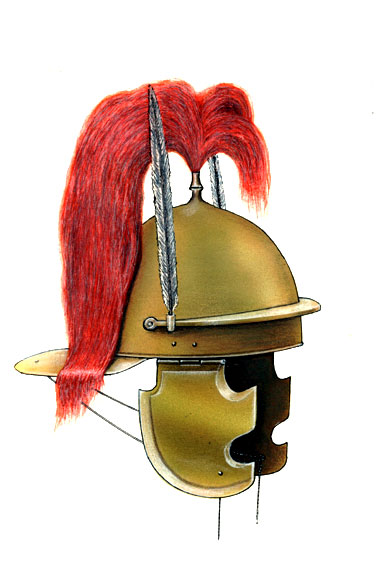
To aid the narrative (the wolf mistakes the fluffy bit on the Roman's helmet for the squirrel's tail), the Roman's armour has a colour scheme that matches the squirrel's.

The image on the left is what I'm going to use as reference when drawing the Roman's helmet. It took a while to find a helmet on Google Images that could, in a specific scenario, feasibly pass for the tail of a squirrel (quite an important factor in the overall narrative, worryingly), as the plumage is usually more rigid and linear, so it was a relief when this picture popped up.

Oh! And I also cranked up the vibrance a bit on the background. It was a little pointer from Sean that made a surprisingly big difference to the overall look and feel of the animation. In a good way, I hasten to add. So yes. That's good.

I'm filling this post with lots of images because I've just had a big mug of coffee.

Sam and Jake are working well. Sam's having some slight difficulties with inbetweening - some of his movements are a bit jerky and lack easing in/out and movement arcs - but I think it's probably my own obsessive perfectionism that's getting in the way. I'm occasionally torn between creating as perfect a homage to Tex Avery as I can and forgiving the artistic quirks and imperfections of my colleagues to give the cartoon a bit of character. It's all good, though. I'm constantly tweaking the workload.

Sam's going to be doing a little less inbetweening and a little more... other stuff. As well as stitching together a new soundtrack (or simply polishing up the existing one), he will be adding the colour to the final animated characters. I've coloured in a few small areas, so there's an established colour scheme.

We see you, mister cameraman!
Jake will finish off any animation that I can't complete myself, and will add some subtle scratches to the final film in After Effects. He's made countless valuable contributions regarding the narrative and the layout, so special credit where it's due; among other things, he suggested that there be film cameras and scaffolding on-screen to help convey the idea that the characters are leaving the set.

Er, yes. And so endeth the SPUD for today. Leave in an orderly manner via the fire exit.

Wednesday, December 7

Final Layout

Assignment ANI1017M
Having made some minor tweaks, I'm happy enough with this picture to submit it as my final layout design. I removed some of the intrusive silhouettes in the immediate foreground and added a slight vignette effect to give it added depth and atmosphere.

Wednesday, October 19

Layouts

Here are a few layouts that I created as an exercise in composition, lighting and colour.

This first one, a slightly clichéd 'haunted house' scene, is mainly an exercise in composition; I tried to strike a rough balance between the moon and the house. I also experimented with contrasts, creating a striking contrast between the moon (and its light) and the cold, dark blue environment, as well as blurring the moon to provide additional contrast with the sharp, detailed house.
The extreme sense of depth, incidentally, reminds me of tilt-shift photography, a method where the immediate foreground and background of a wide-angle shot are out of focus; this leaves a small, very specific area in focus, and so it replicates macro photography and creates the bizarre - but beautiful - illusion that everything in the photograph is miniature and close-up.


Picture number two was more of an exercise in varying colours slightly. I took the concept of areas in shadow being bluer than sunlit areas (as the only light hitting them is directly from the sky) and used it to add a subtle but dramatic effect to the left hand side of the image.
With this picture, I wanted to make it really apparent what direction the main light source (the sun) was coming from (the right). I really went to town with the addition of sunlit highlights to the edges of the tree and the structures on the left, whilst maintaining a gentle but consistent gradient to lighter shades on the right, implying the presence of the sun without having to draw it.


This third and final image is more or less the culmination of everything that came before it (except, perhaps, colour theory, but colour schemes as consistent as this don't allow for it).
I wanted to experiment with the idea of a colour scheme helping to set the mood and the atmosphere of a scene - for example, blues and greys work well for night scenes. But I liked the idea of everything having a dirty, yellowish quality, as though the air is dusty and the environment is poorly-maintained. That notion gave birth to this slightly post-apocalyptic, 'shack in an eternal scrapyard' scene, and as the environment already had a certain character to it, I found it much easier - and more fun - to litter the layout (quite literally) with details and quirks.
Again, I employed blurs to maintain the illusion of depth, which I think works especially well in this picture. Especially with the dust - the out-of-focus particles that appear to be passing right by the camera lens worked really well here, and helped to make it the type of scene that you feel you could almost step into and explore. Needless to say, I'm extremely pleased with this one.


That's it, really. If I think of anything else to say, I'll go back and edit this post, but that rule applies to all my blog posts, so just take that as a given and we'll leave it at that.


Cheerio.