You may have heard the rumours, whisperings between anonymous figures in the shadows. Can it be true? Can the sting be truly finished?
Yep!
Improvements
I've re-recorded the squirrel's dialogue, as the original "testing" was a bit ugly and robotic sounding. Now he says "testing, one two..." and it's slightly high-pitched! How about that?
Also, on the subject of sounds, Sam went and found a sound effect that would work for the moment where the side bit of the Roman helmet falls off and clatters to the ground. It gives it a bit of weight, and subtly enhances the humour of the moment.
Anyway!
Here it is, in all its Tex-icity and Avery-ness...
Recently, I've been focusing on trying to make the sting look as though it was hand-drawn and shot onto film. This was the way it was done in the era I'm mimicking, so I thought it'd be nice to somehow imperfect the inherent sharpness and consistency that you get with Flash animation.
I exported the sting as it is at the moment (90% complete, I'd say), popped the Quicktime video into After Effects and added veeery subtle flickers and grains to the footage. Now, even moments of stillness are given a slight energy by having no two frames be exactly alike; it's as though each frame is an individually printed still on a film reel, subject to slight photographic changes that you wouldn't get with a digitally-produced video.
In addition, I blurred the video slightly, to remove that distinctive Flash animation sharpness. To retain the detail of the original footage, however, I made it so that the blurred version of the video was overlaid over the original, using the 'darken' blend setting.
Don't understand? I'll give you a hand!
The image above should help to simplify matters a bit - like the hand, I've increased the size of the blur so it's easier to see.
Picture (A) is simply a picture of a hand, drawn in Flash and exported as it is. It's very nice and all, but it's very clean. Clean can be a good thing, but when you want to subtly obscure the fact that it was made on a computer, such perfect sharpness can be a dead giveaway.
If you're trying to reduce the sharpness of the image, the next logical step is to blur the image, as demonstrated in picture (B). You reduce the sharpness, but you also lose the resolution. Leave it like this, and you might as well reduce the resolution of the video. And that's a big no-no. All that work, wasted on a low-res video where many lovingly-crafted details are indistinguishable! Imagine that! Gah!
So! That's why I settled on the method employed on picture (C). As mentioned earlier, I overlaid the blurred image over the original, setting the blend to 'darken'. The blur's still doing it's thing, darks blending into lights and lights blending into darks, but the original outlines can still be seen clearly. It's a happy compromise, and I really like the effect it has on the sting. Combined with the grain and the flicker, things look more old-fashioned and filmic.
Here's the video, by the way. Due to YouTube compressing the video, the blur and the grain are hard to spot, but the flicker's visible (watch in 480p).
It was as much about getting the look of the wolf down as determining the look of the background - I imagined it being very detailed and textured, as the detail of the tree, and the texture of the ground and sky, show.
The tree above's fairly detailed,
but the camera lingers on it for a while.
The background didn't end up as detailed as this, as it had to be a long image for the camera to track across. To spare the agony of such a large task, I simply retained the textural look. This helped to make the background and the animated characters/objects in the foreground distinct from each other, to give the impression that the sting consisted of inked and painted cels laid over a hand-painted backdrop.
You can also see how much more muted the general colour scheme was going to be at the start of the project. Sean was right - with the slapstick and general fast paced comedy and action, it made more sense to be as loud with the colours, so the overall vibrancy was cranked up considerably.
Oh, Mr Wolf!
The concept art sums up the wolf's personality quite well, too. Nailing the character of the wolf so early on in the creative process was a good idea, as it helped me to add little nuances to his performance as I animated him. He's a typical cartoon villain - determined, angry, but slightly incompetent and bewildered.
The novelty of the acronym may be waning, but the workflow certainly isn't!
Everything will be stitched together in the next couple of days. There are lots of chunks of animation floating about, being completed here and there, but this is how the mothership currently looks. This is the stuff I've done.
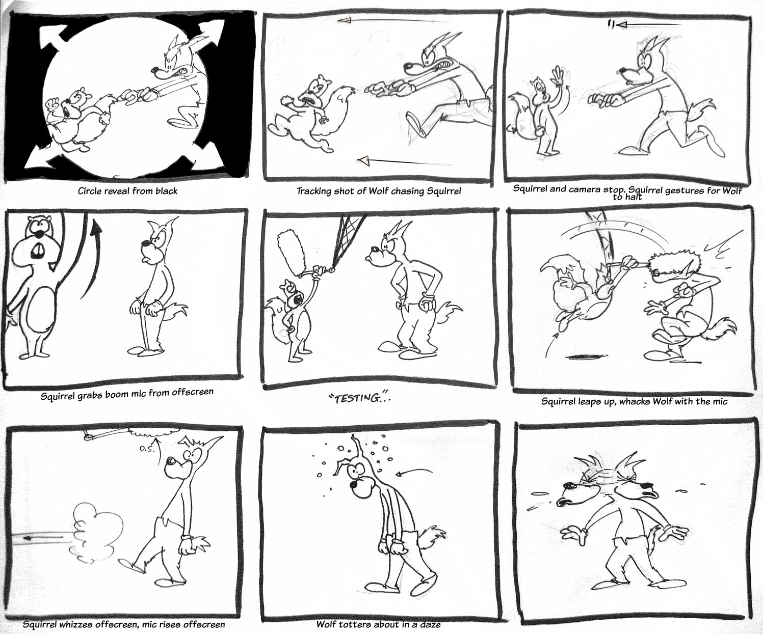
Pay extra attention to the animation of the squirrel! There's no interesting fact to follow that request - I just really like the animation...
The squirrel is finished now. That's something that can be permanently scribbled out of the to-do list in permanent marker for all I care.
He finally has a tail! I wanted to animate the body first, so that the tail could then be animated to drag slightly as it reacts to the movement. Also, the existence of the tail makes the big, climactic gag easy to see now.
I've also included shadows to all the characters instead of just the Roman. It draws less attention to the fact that his shadow is only there for dramatic effect, without dampening the impact of his appearance.
The boom mic's finally finished. I was daunted by the idea of animating it, as it's a fairly rigid form with bits that pivot in pseudo-3D directions, but it turned out quite well in the end! I did end up copying and pasting the upper bit of the boom mic pole, repositioning it for different frames, but it gives the animation a bit more solidity and consistency. I forgive myself for that one.
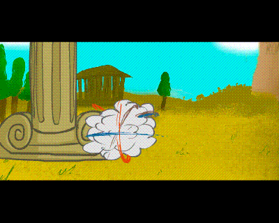
Also, the fight cloud's been enhanced with stars and scraps of fur to enhance the sense of violence, and it breaks up instead of vanishing, revealing the wolf slightly more gradually.
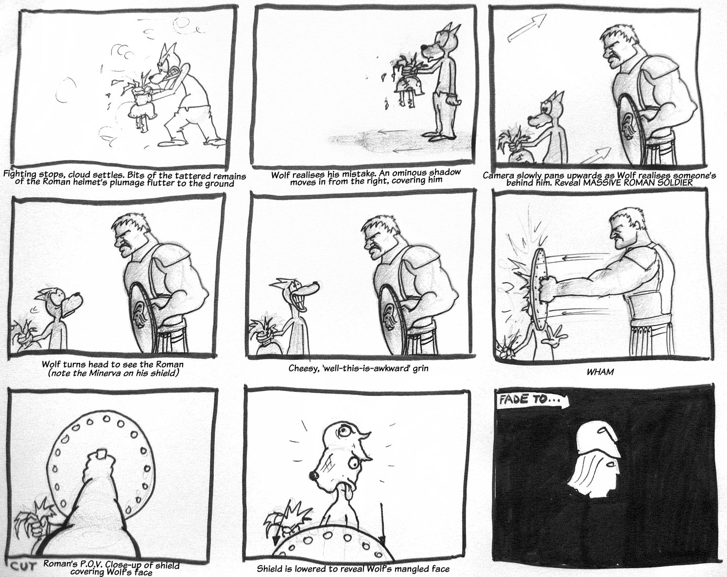
Note the remaining scraps on the wolf's head, cementing the notion that there's more or less no way he's going to explain his way out of the situation he's in - he's blatantly the culprit, no matter how much he tries to smile his way out!
Right! Hello! Good news! I've finished the end of the sting!
The other bits just need doing now. Nearly finished, though. Here's another GIF.
In the final sting, the fight cloud will gradually break up to reveal the wolf instead of just vanishing abruptly, and there will be a few stars and exciting lines and shapes emerging from the cloud as it whirls across the set. There will also be tatters of the helmet's plumage flying everywhere, each piece individually animated (more fun than it is difficult, I assure you) so that they flutter to the ground and stay there. This makes it funnier when the wolf stops and realises his mistake - the whole set's covered with the remains of what is definitely not the squirrel he was after.
Is this a SPUD? I'll call it SPUD #2.5, and leave it at that.
Anyway.
Here's a little animated GIF that I thought you'd like to have a look at.
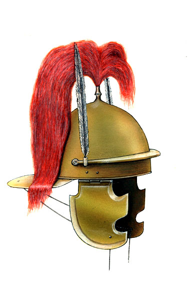
As you can see, I've used that picture of the Roman helmet as reference. It's always worth doing a little bit of research, especially for aesthetics, because a little visual element (or a lack of a visual element) can determine whether or not the audience 'gets' what they're supposed to be looking at. For example, the flappy side bits to the helmet - I don't know their names - look very Roman now, because I wasn't just drawing from memory. It helps to say 'look, this is a Roman helmet' in the space of about a second.
And in a twenty second animation (let alone a twenty second Tex Avery-influencedanimation), such speed is essential.
Here we are again, another SPUD (Sting Production UpDate). We'll see how long it takes for that particular acronym to lose its novelty.
So! I've finalised my designs for the Roman. Here he is.
The original Roman
Compared to the version in the animatic, he is considerably more cartoony - his jaw's much squarer, and the top of his head is tiny compared with the rest of his body.
To aid the narrative (the wolf mistakes the fluffy bit on the Roman's helmet for the squirrel's tail), the Roman's armour has a colour scheme that matches the squirrel's.
The image on the left is what I'm going to use as reference when drawing the Roman's helmet. It took a while to find a helmet on Google Images that could, in a specific scenario, feasibly pass for the tail of a squirrel (quite an important factor in the overall narrative, worryingly), as the plumage is usually more rigid and linear, so it was a relief when this picture popped up.
Oh! And I also cranked up the vibrance a bit on the background. It was a little pointer from Sean that made a surprisingly big difference to the overall look and feel of the animation. In a good way, I hasten to add. So yes. That's good.
I'm filling this post with lots of images because I've just had a big mug of coffee.
Sam and Jake are working well. Sam's having some slight difficulties with inbetweening - some of his movements are a bit jerky and lack easing in/out and movement arcs - but I think it's probably my own obsessive perfectionism that's getting in the way. I'm occasionally torn between creating as perfect a homage to Tex Avery as I can and forgiving the artistic quirks and imperfections of my colleagues to give the cartoon a bit of character. It's all good, though. I'm constantly tweaking the workload.
Sam's going to be doing a little less inbetweening and a little more... other stuff. As well as stitching together a new soundtrack (or simply polishing up the existing one), he will be adding the colour to the final animated characters. I've coloured in a few small areas, so there's an established colour scheme.
We see you, mister cameraman!
Jake will finish off any animation that I can't complete myself, and will add some subtle scratches to the final film in After Effects. He's made countless valuable contributions regarding the narrative and the layout, so special credit where it's due; among other things, he suggested that there be film cameras and scaffolding on-screen to help convey the idea that the characters are leaving the set.
Er, yes. And so endeth the SPUD for today. Leave in an orderly manner via the fire exit.
Hello. This is a sting production update. Or SPUD for short.
My animatic was selected to be made into a fully animated sting, and so now I have two team-mates: Mr Jake Longworth and Mr Sam Sanalitro.
The workload has been divided as follows: I provide most of the main keyframes to outline the movement, and then Jake and Sam do the in-betweens. The more complex the action, the more input I'll have. Sam is going to be creating the final soundtrack, and Jake is going to be assisting with colouring-in and general editing.
To get the ball rolling, I animated the beginning bit. Here it is, albeit in a slightly lo-res .gif format:
Sam and Jake are really very good at in-betweening now. After a couple of brief sessions in which I explained the characters and my drawing methods, they latched onto my style of working quickly, and are producing some really good work.
Speaking of which, other segments of the animation are nearing completion, but they're not in chronological order. I'll pop them into the sting soon, the unfinished areas filled with the animatic, to show you how well everyone's doing.
I've been storyboarding an idea for an animated sting. Our brief gave us three criteria: it had to be in the style of a certain film/animation genre (we had a list of genres to choose from), it had to incorporate the university's logo, the Minerva, somewhere, and it had to be twenty seconds long.
I was attracted to the style of Tex Avery, because his fast-paced, madcap style lends itself well to the twenty seconds of running time and the genre's fairly open to original ideas and creativity.
Anyway. Enough chitter-chat. Here's the storyboard.
I then started thinking about timing. How is this sting going to be spaced out? At what point in those twenty seconds will certain things happen?
To answer this, I did a rough copy of the drawings in Flash (I didn't have digital copies of the actual storyboard at the time), and created a twenty second animatic with audio I stitched together from snippets of soundtracks from MGM cartoons of the period (MGM was the studio where Tex Avery worked on the cartoons that have become synonymous with his name). I'm going to re-do it with the actual drawings sometime soon, but for now this will do. It's served its purpose.
And here, people who want to see the animatic, is the animatic!
I'm trying my hand at mimicking a genre in preparation for storyboarding a sting. I think I'm going for the look of a '50s sci-fi movie. Here's an idea of what I've got planned...
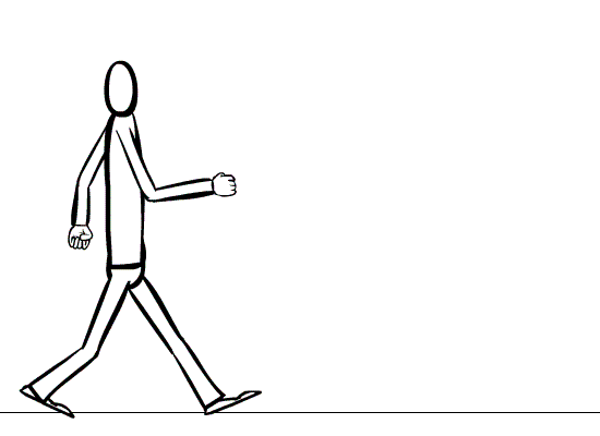
We began by trying our respective hands at a traditional walk cycle, or as Neil rather neatly put it, a 'vanilla' walk cycle. As it was the first one I did, I decided to play it safe regarding consistency of volume and create my walking man out of individual, repeated sections, which I adjusted accordingly for each frame. This puppeteer-like approach might have led to me being slightly extravagant with the arm animation; he sort of looks like he's doing a self-congratulatory fist pump for every step. "Another step towards the right hand side of the page! Get in!" Hardly normal behaviour.
So, er, yes. Moving on.
I then started to deliberately imbue my walk cycles with personality. So far, the two walks I've nailed are depressed and angry. I'm also going to do worried, laid-back and happy-go-lucky.
DEPRESSED WALK
I was going to flesh out the 'depressed' stick man, but I liked the fluidity of the motion and decided to keep it as it was. Fleshing it out, at this stage, wouldn't really add much to the performance.
I wanted it to look as though the man's legs were barely carrying him, so I made them drag along the floor as they moved forward. The weight is almost always on the front foot, to make him seem heavy and likely to collapse at any moment, and his head bobs considerably. Not only does the head bob give the feel of a very forced walk, but it also taps into the character's possible psychology. People tend to keep their head still when they're trying to keep up appearances; here is a stick man who cares very little about how the world perceives him at the moment.
Too deep?
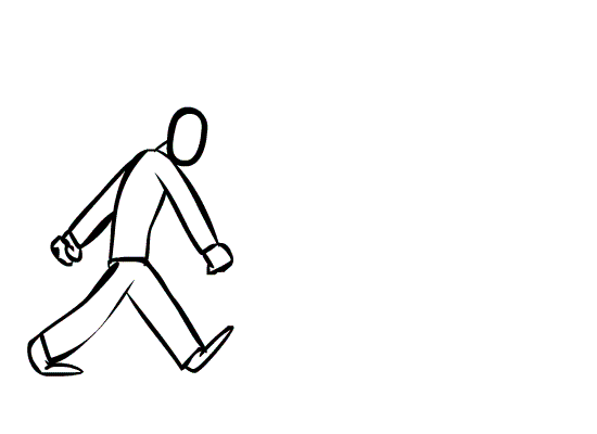
ANGRY WALK
For my next walk cycle, however, I didn't bother with an initial armature - the animation principles I had been taught were beginning to become instinctive, and I felt more confident animating a slightly more fleshed-out character. In addition, I animated on twos this time (changing the image every two frames instead of every one); as much as I like the fluidity of animating on ones, it's a bit time-consuming (twice as time-consuming as twos, mathematically speaking).
The lift of the leg as it passes forwards, the clenched fists, the lowered head, the forceful, pendulous swing of the arms - this chap is seriously pissed off. I wouldn't cross him.
Anyway. That's it for the moment. More walk cycles soon!
Well! Here we are again, Blogger! Just when it seemed as though I'd moved over to Tumblr for ever, back I come!
This is a blog for my animation course. I'll be posting up all sorts of knick-knacks as I progress through the course, and I'll be including an occasional commentary on certain areas.
This post is really just a way of seeing how the final post will appear, what with all the tweaking and adjustments I've made in regards to the blog's appearance.